Depend Spring Collection 2010

I don’t know why, but this entire collection gets me thinking of bags from Mulberry, must be the colors 😉 Once again the small pictures is Depend’s own PR pics and thanks again to Star PR for sending me these to review 🙂

First up is No. 185 which I actually put on when I took pictures for my last post, but never got a picture of because of the light. So this is after wearing it since Saturday, 6 days and this is without a topcoat. So the chipping has been very limited and the wear ability is quite good 🙂 I think this might be my first orange color and it took some days before I was use to it. But I actually quite like it. About 1½-2 coats to have full coverage.

No. 186 is a deep chocolate brown. The color really looks like real chocolate, hard to resist not tasting it haha 😛
Really good coverage with only one coat.

No. 187 this is one of the colors that makes me think of Mulberry.
It was hard to capture the real color since the sun was setting here 🙁 But its a nice neutral color that covers with 2 coats.

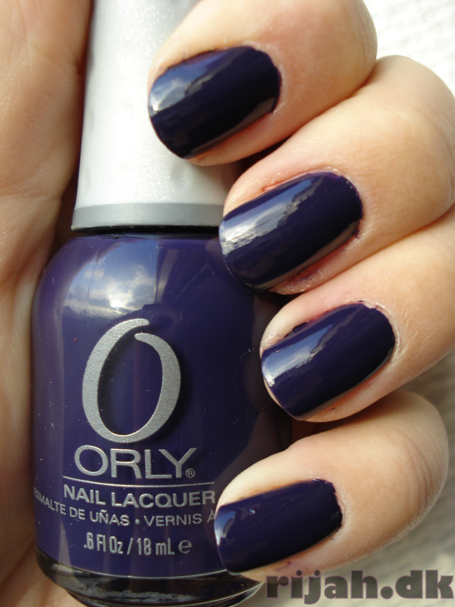
No. 188 one more of the Mulberry colors 🙂 Think this might be a easy alternative for the much hyped
Chanel – Particulière, although this is a bit darker than the Chanel is. I am gonna do a comparison of these in another post 🙂 This had good coverage with only one coat

No. 189 a brown/red color that gets me thinking about the dessert with red dirt on the ground, cowboy movies with native Americans and horses and gunfights. Maybe my mind is floating a bit here but that’s what I think of when I tried this color 😛
I have a vivid imagination might one say 😛 Good coverage with 1½ coat.

No. 191 is maybe not a spring color when I look at it.. I am thinking Christmas more than spring and that’s only because of the shimmer. I think if it has been without that shimmer and just a full creme it would have been more in the springy colors.  Needed a good 2 coats for full coverage.

No. 192 last one of the bunch and I almost ran out of sun here. Thinking that’s why it differs so much from the bottle picture. When I had it on it looked a lot more flesh toned than on the picture. I really like this color, very very neutral color almost Mannequin hand like. But only almost 😛

To conclude, great collection with some very nice colors in it. Good alternatives for the trends of this seasons more expensive colors 🙂 Any questions, just leave a comment and I will do my best to answer it 🙂
Thanks for reading and/or looking 😉

New Depend's

I was gonna do all of these in one post, but do to unforeseen circumstances (the weather = no sun), I had to split it up in 2-3 posts. So starting out with the first 3 in this one 😀 The little pictures is Depend’s own pr-pics and a big thanks to Star PR for sending me these polishes for review 🙂

First up is no. 158, great creamy pink, needed a good 2-3 coats for the best coverage, Depends picture differs a very tiny bit, this is a shot in full sun so I guess why the difference is so big.

Then we have no. 184. Great lilac/grayish color. Love the dusty look on it 😀 Have really good coverage with 1½-2 coats and sorry for not having a sun picture of this 🙁 Ran out of sun late in the afternoon 🙁 If you want me to re-swatch this when theres some sun out, please write a comment, so I know if there’s anyone needing it 😉

No. 190. This is a really hard color to capture. because of its shimmer, it needed around 4 coats for this much coverage, but if you are looking for a sheer polish this is perfect. If I stopped with 1-2 coats it didn’t do much for my yellowish nails underneath, so at least 3½-4 coats for nails like mine 🙂

NOTD / BB Couture – Balboa Beach Bunny

Got this with this months Nailmail along with 2 others polishes from BB couture.

Love the different color shimmers it has in it 😀 Pretty good coverage with one coat however I found it a bit difficult to apply.

Anyways I love this deep purple color! Had it on for 2 whole days before removing it again and that’s was only so I could swatch some other stuff 😛

Orly – Wild Wisteria, Ginger Lily and Pure Petunia

This is the second half of the bunch I got sent* and thought it was about time to do this 😉 The Orly Bloom Collection which most likely represent some of the spring flowers(I don’t know that for sure though :P) that you can expect to see when spring comes around. All the colors in the collection have names after a flower that seems to be within the color range of the polish.

First one is Pure Petunia and the pictures I found on the web have so many different colors so I am guessing without being a big green-thumbed person that it’s a flower that’s being mutated and bred in all kinds of ways, but I think the one I found have a somewhat similar color to the polish ;D And no matter what its a really lovely purple creme color and good coverage with 1 coat ;D

Then there is Ginger Lily which is a like orangy / bronze colored polish. When I saw the color in the bottle I didn’t really like it, but it looked better when I put it on the nails 🙂 This also had excellent coverage with 1 coat 🙂

Last but not least the Wild Wisteria, very dark purple color which in some lights come out like a more dark blue color. Very hard to capture the real colors with this one. But I can definitely see a color similarity in the flower. And like with a lot of dark colors it has good coverage with only 1 coat needed 🙂 I really like these 3 colors from the collection and would love to show you the second half, but I don’t have it and it wont be release until sometime in February. If you want to check out the other colors in the collection its spread out on a few blogs but try to do a google search on Orly Bloom collection and it should be easy to find them 🙂 Thanks for looking/reading <3

*Collection was sent to me from the manufacturer.